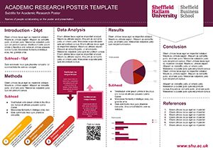
Designing an Academic Poster
 A poster can be produced using a wide range of software, some more advanced than others, some allowing you to collaborate online with other users. If you need to print your poster for an exhibition as long as your chosen software can export your file as a PDF (Portable Document Format) the print unit will be able to print it for you.
There is a wide range of software that will allow you to create a poster but we recommend the following.
- Online: Google Draw (allows collaboration and is easy to use) – EASY
- PC: Publisher (available on any PC where Microsoft Office is installed) – INTERMEDIATE
- AppsAnywhere: InDesign (industry standard desktop publishing) – ADVANCED
As with all software each has a learning curve and the more sophisticated the software the greater flexibility it will give you. Software is always a trade off between ease of use and functionality.
Setting up
There are several steps to bear in mind before producing your poster.
- Setting your document size. What size will it need to be printed? The standard measure for paper sizes in the UK is the ‘A’ format. A3 is twice the size as A4 which is twice the size as A5 and so on. If you are creating a poster that needs to be A1 (841mm x 594mm) setting your artwork up as A3 will be sufficient for it to print well without it pixelating. A3 is 420mm x 297mm.
- Content. It is advisable to collect all your information together before construction your poster. This includes text, images, graphics etc… Using standard file formats makes importing your resources in to your chosen design software easier.
- Text. Use a Word format .doc or .docx or a plain text file .txt.
- Images. Use Jpegs (Joint Photographic Experts Group) files .jpg
- Graphics.Use PNG (Portable Network Graphics) files .png as they support transparency.
- File for print. Most printers, desktop, in-house or commercial will print from PDF. As long as the software you choose to use can export your final file as a PDF you will be able to get it printed.
Information
Remember to add the following:
- University/Organisation branding
- Name of the project/study
- Subtitle/strapline
- List of names of people who contributed to the project
Depending on the use:
- Introduction
- Methods
- Data analysis
- Results
- Conclusion
- Graphic elements/images
- References
- Acknowledge any resources used
You may also want to add:
- URL/links to further information/organisation website
- QR Code to link to extra information or videos
- Augmented reality using an ‘app’ such as Aurasma
Design Elements
Think about the colours you use. Different colours provoke different emotional responses in people. Warm inviting tones can be comforting, blues and greens can be cold and a clash of very bold colour, reds and black can be intimidating.
Fonts can also be used to distinguish different areas of text, add weight to sections and give a different feeling to the information.
Think about the message the images you use convey. Do they set the right tone, illustrate the point, convey the message or create tension?
Example
Useful Links
A list of paper sizes – A0 to A8 (International Paper Sizes)
Free websites where you can produce infographics. Useful to illustrate key points in your poster to make data/information easier to understand.
This site will allow you to pick colours which are complimentary to give your poster a good look and feel. https://color.adobe.com/create/color-wheel/
Output
Save your final poster as a PDF so that it can be printed.


