Google Maps can be used to plot data graphically. Custom maps can be created and data inputted to show the locations of organisations/information. Data collected via a Google Form and stored in a Google Spreadsheet can be used to populate the map.
For example, you’ve decided that you want to collect information about the various sports organisations, teams and facilities in Sheffield. The first step would be to create a Form to collect your information. Remember to have a field for the postcode (set to required) as Google Maps will use this to plot the information.
You’ve decided that you want to break down the information in three categories, venues/facilities, organisations/teams and retailers. Publish your form and contact the organisations and ask them to complete the form. Once all the data is collected, sort it in the spreadsheet and put each set of data on a different sheet.
Create your custom Google Map, and in each layer you can import your data (saving it out a separate .CSV file for each layer). The data will be mapped automatically and then you can edit the markers to suit your needs. Each layer can be turned off independently so you can see the sorted data and how they correlate altogether.
Your custom map can be embedded on a web page to make it accessible to the public if required.
Below is a guide to how to do it.
Google Maps is not available through a University account. To create a map you will need to create your own Google account.
Create your own account and go to Goole Maps and sign in (https://www.google.co.uk/maps).
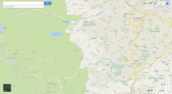
In the top left-hand corner click on the search box and in the dropdown menu click on create custom map. This will open up a new window. In the top left-hand box there will be a dialogue box in to which you can edit the name of your map and add a description.
In the free version of Google Maps you can have up to three layers on a single map. You can change the name of each layer by clicking on the layer name and then editing the text. You can then upload your data to google maps. It can be uploaded as a CSV, XSLX or KML file. Each layer will require a different spreadsheet, so organise your data beforehand. Decide what you want to be displayed on each layer and create a new spreadsheet for each.
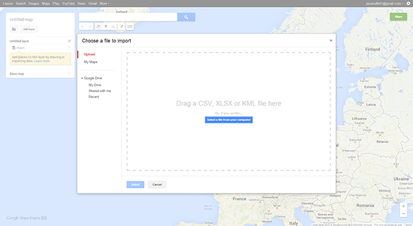
Information can be uploaded from a Spreadsheet that is saved in either the CSV or XLSX or from a KML (Keyhole Markup Language) file format.
In your spreadsheet you will need to create a column for the co-ordinates for each location. This can either be the postcode of the place or the longitude/latitude co-ordinates. Then create a column for each piece of data you want to appear in the dialogue box on the map. This could be the name of the organisation, location, type, and then any other information you wish to be displayed. This will appear in a pop-up when you hover over the pin marker on the map.
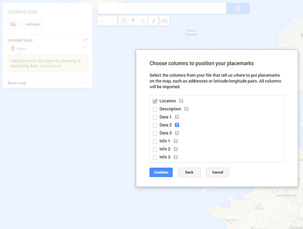
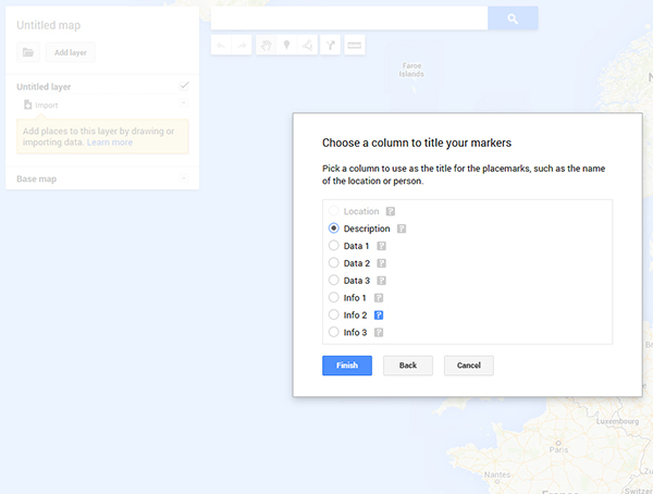
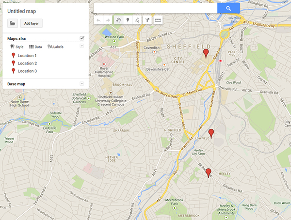
When you upload your spreadsheet Google Maps will ask you to tell it which column to use to position your place marks. Use the post code or longitude/latitude column. It will then ask you for the column to use for the title of each place marker. Pick the column that defines the location. Google Maps will automatically add your place marks on the map.
In the dialogue box you can then alter the style, data and labels that appear on the map. New locations can be added by clicking on the data tab, right clicking on the table that appears and then inserting a new row. You can alter this for each layer. The paid version of Maps allows you to have up to ten layers and 10,000 lines in each spreadsheet.
Boundaries can also be drawn on the map to define areas and give your map an extra dimension.
Google Maps can also be embedded in a webpage. Make sure that before embedding, the privacy is set to Public, on the web.
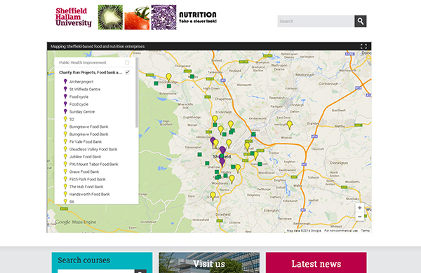
An example of a custom map embedded on the Nutrition societies’ page. Note that users can turn on and off different layers to display the information they require.

