After the Blackboard upgrade at the end of July, there will be some changes to the interface in Blackboard and shuspace.
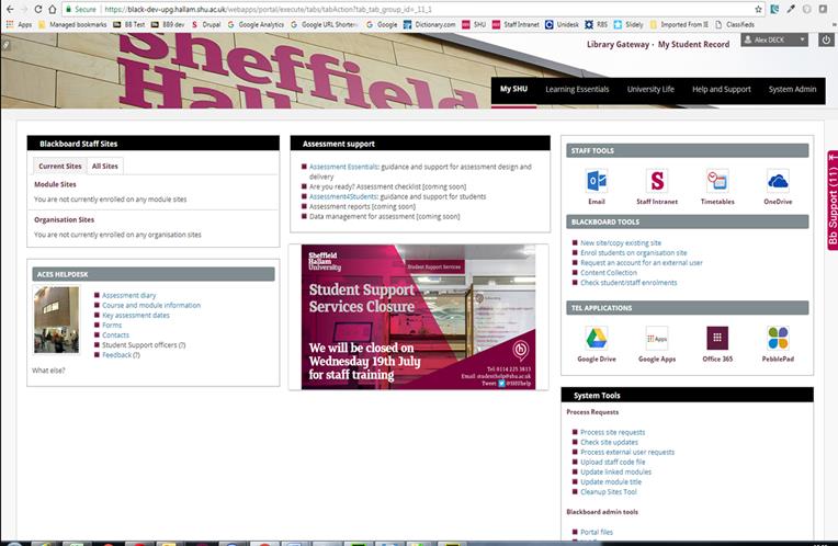
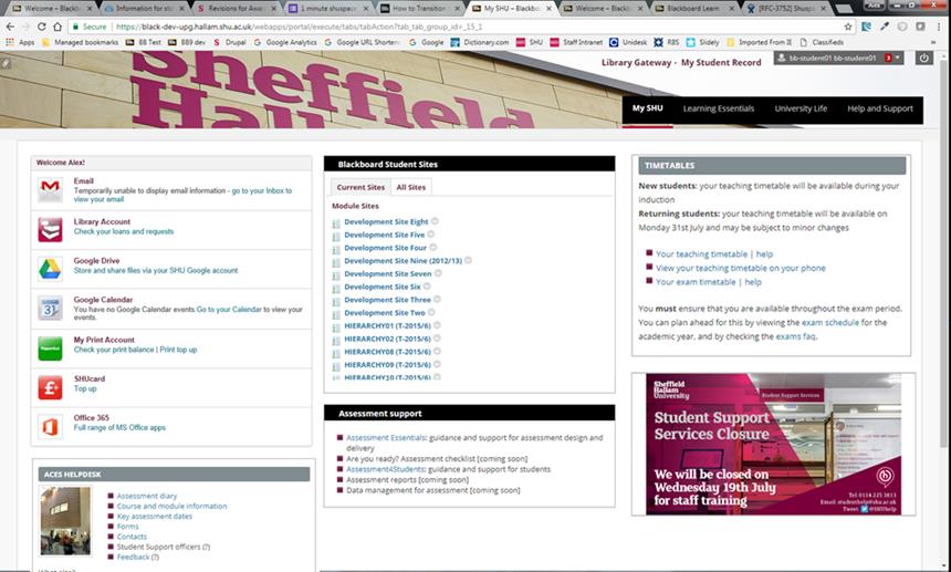
shuspace is being refreshed as part of the upgrade, with a new banner at the top and a modern look and feel for the channels and tabs. Some of the less used areas have been removed to reduce clutter and key information to support the Assessment Journey will be added for staff and students. Screenshots of the staff and student My SHU tabs are below:

Staff view of shuspace

Student view of shuspace
Support for mobile devices will be greatly improved in shuspace and Blackboard after the upgrade, as a principle called responsive design will be embedded. Responsive design means that the interface adapts to the screen size of your device. For instance if you view shuspace on a mobile device then the information from the three columns will be condensed into a single vertical column. If you view a Blackboard site on your mobile phone then the left-hand menu will shrink as you look at content. You may notice some tools like the Grade Centre display differently on mobile devices than PCs as a result. Better support for mobile devices is one of the top student requests around shuspace so we hope this update will be well received by students.
Blackboard will now include support for dragging and dropping files into many areas, including items, assignments and discussions. This will mean staff can upload many files at once by dragging and dropping groups of files in. In addition, some browsers will support dragging a folder in which will result in all of the files in that folder being uploaded.
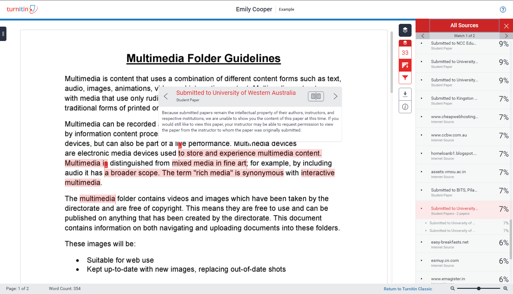
TurnItIn originality reports will also have a different look and feel due to a separate upgrade they are doing 1 August, though functionally the reports will be similar.

New TurnItIn report look


