Visualising the Project
In this project primary teachers were invited to choose aspects of literacy teaching that mattered to them, collect data on those aspects, and find ways of representing the data on postcards. The teachers were creative and imaginative in exploring and visualising their everyday experiences of literacy teaching.
How might researchers approach the project data in a similarly open way? Might alternative data visualisations of findings mediate alternative insights? What might digitally mediated visualisations offer or obscure? In what ways might visualising data stimulate reflective or critical commentary? How can visualisation be used as a process through which data can be arranged, viewed and understood differently?
Here we present some visualisations that represent all the data from our project (the postcards and transcribed meetings). We hope these provoke discussion about what different kinds of data visualisations can offer to educational research.
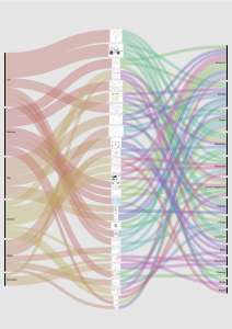
Relationships between topics, postcards and themes
This visualisation links together three phases of the project: a) the prompts the group agreed to use for each of the six postcards; b) the postcards which were created by the participants; and c) the themes or postcard types which emerged during analysis.
Will exploring some aspects of literacy classroom practice be more likely to result in postcards/visualisations of a particular type? For example, if the topic attends to movement, are maps a more likely result? And if this is the case, what does that suggest about how we might be inexorably drawn to particular visualisation types when we present data? What might we notice if we deliberately set out to visualise in unconventional ways?
Supplementing a visualisation; a subjective view
This visualisation attends to the interpretability of the postcards - how straightforward it is for the reader to interpret them.
Do visualisations which are more easily interpreted, like those on the right of the continuum, suggest a greater degree of confidence in the designer’s understanding of their research topic, or a selective interpretation? Are those which are less easily interpreted, owing to fewer contextual cues, telling open stories which invite further comment?
Visualising dialogue using MS Excel
This visualisation focuses on the transcripts of the discussion which took place at one of the teachers’ postcard sharing meetings.
Might professional discussions have characteristics which can be identified by visualising transcripts? And if so, how might an understanding of the patterns which emerge help the participants in the discussion?

