Author: Ian Guest

‘Mapping a text’

A post from Pat Thompson found my attention this week (Pat blogs about academic writing), not so much for the advice in the post, good though that was, but for the visualisation she used as a metaphor.

Visualisation: Geographical Guides to a Man's and Woman's Heart

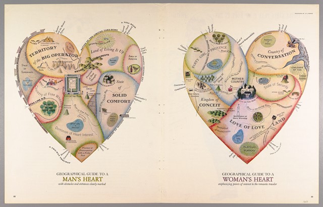
“Geographical Guides to a Man’s and Woman’s Heart” released by “Cornell University – PJ Mode Collection of Persuasive Cartography” under a Creative Commons Attribution-NonCommercial-ShareAlike 3.0 (CC BY-NC-SA 3.0) Unported License.

Gendered concerns aside, I wonder if a story could be visualised using similar principles and if appropriate, how might it be adapted to highlight the numerical aspects?

Inspired by Daniella…

Listening to what Daniella had to say last night inspired me to seek further inspiration. I soon came across ‘Makeover Monday,’ a site supporting a community of people working with visualisations. Each Monday a new publicly available dataset is shared and the community sets about producing visualisations which can be seen in the Gallery. A recent one immediately caught my attention; it shared energy consumption at No 10 Downing St. The raw data taken from electricity meter readings produced just three columns: date, time of day, and electricity used. What surprised me was the variety of different ways that people chose to visualise one simple thing which changes with time (click on the image to explore the gallery more closely):

Electricity used at Number 10

Click the image, then in the new window scroll down 2019 to Week 4.

As you scroll down through the gallery, you’ll doubtless get plenty of further inspiration from other weeks for the different ways people present the same sets of data.

Maybe there are some literacy-related things which change with time in your classrooms/schools?

‘Dear Data’ video

The authors of Dear Data, Giorgia and Stefanie, presented an early version of the progress of their project, prior to authoring the book. It’s interesting to hear them discuss their thinking and the processes through which they created their images.

Their humour and the warmth of the relationship they developed during the project shine through.

Visualising daily activity

artwork visualisation in wood of Laurie Frick's daily activitiy

“Daily Activities” by Laurie Flick http://www.lauriefrick.com/sleep-patterns/ shared under a Creative Commons (BY SA) license

The header image of this blog shows a small section of this artwork visualisation by Laurie Frick and created “using a fitbit, mytracks and a catcam to hand collect and hand-build these collage works.”

A Sketchnote from a ‘Dear Data’ talk

sketchnote of a talk on data visualisation from the trenches by stepahie posavec

“Data visualisation from the trenches” flickr photo by jennychamux https://flickr.com/photos/97823772@N02/32459197702 shared under a Creative Commons (BY) license

This sketchnote was produced by Jenny Cham from a talk by Stefanie Posavec – ‘Data visualisation from the trenches

Project inspiration

One strand of discussing what matters to teachers in their everyday literacy teaching, participants will present their data on a series of postcards – one per half term. This idea is inspired by a year-long postcard exchange by two information designers who documented their everyday lives using hand-drawn often quirky visualisations of data.

More detailed information and plenty of examples of the postcards they exchanged can be found at their Dear Data site.

For those who prefer or find it easier to listen, a podcast interview with Giorgia and Stefanie can be downloaded from the ‘Data Stories’ website.