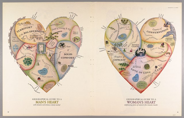
A post from Pat Thompson found my attention this week (Pat blogs about academic writing), not so much for the advice in the post, good though that was, but for the visualisation she used as a metaphor.

“Geographical Guides to a Man’s and Woman’s Heart” released by “Cornell University – PJ Mode Collection of Persuasive Cartography” under a Creative Commons Attribution-NonCommercial-ShareAlike 3.0 (CC BY-NC-SA 3.0) Unported License.
Gendered concerns aside, I wonder if a story could be visualised using similar principles and if appropriate, how might it be adapted to highlight the numerical aspects?
Leave a Reply
You must be logged in to post a comment.