Listening to what Daniella had to say last night inspired me to seek further inspiration. I soon came across ‘Makeover Monday,’ a site supporting a community of people working with visualisations. Each Monday a new publicly available dataset is shared and the community sets about producing visualisations which can be seen in the Gallery. A recent one immediately caught my attention; it shared energy consumption at No 10 Downing St. The raw data taken from electricity meter readings produced just three columns: date, time of day, and electricity used. What surprised me was the variety of different ways that people chose to visualise one simple thing which changes with time (click on the image to explore the gallery more closely):
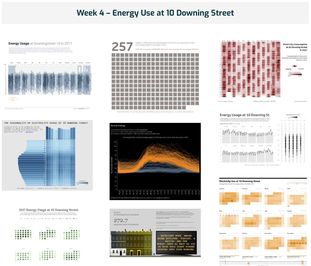
Click the image, then in the new window scroll down 2019 to Week 4.
As you scroll down through the gallery, you’ll doubtless get plenty of further inspiration from other weeks for the different ways people present the same sets of data.
Maybe there are some literacy-related things which change with time in your classrooms/schools?
Leave a Reply
You must be logged in to post a comment.